Every aspect of the Better Together Brand was made with careful consideration to our values as a healing practice.
At our core, we are:
- Attentive - Passionate about caring - Not afraid of showing emotion - Humanistic - Empowering
Most importantly, we want our patients to feel relaxed, cared for, supported, energized, and more whole than when they came to us. This feeling is something we wanted to capture with not just our services, but our logo, color palette, imagery, typography, and writing.
“Our intention for this website was to create a digital space that felt calming, safe, and open.”
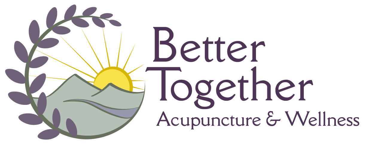
Lavender encircles a landscape that opens before the viewer. Within, two mountains come together - hinting at our name. The sunrise over the landscape symbolizes hope & new beginnings, with acupuncture needles forming it’s rays.
If you look closely, you’ll notice that every element is represented in some form - fire, earth, wood, metal, and water. These elements are fundamental to traditional Chinese medicine and our healing practice.
Colors & Type
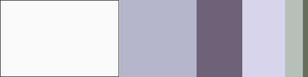
Our color palette is inspired by a walk through a field of lavender, and the feeling of relaxation that scent brings.
Poppins presents as a clean and friendly body text, while Proza Libre offers the same with a twist of elegance as a humanist sans-serif.